To Heptabase Users: 2022 Recap
What we’ve done in 2022 and what we plan to do in 2023.

Dear Heptabase users,
I’m Alan, co-founder & CEO of Heptabase. It’s been almost a year since we launched our public beta, and now is a great time for a yearly reflection. In this article, I will focus on what we’ve done in 2022 and what we plan to do in 2023.
Vision Recap
To recap, we started Heptabase with the vision to create a contextualized knowledge internet, and an ecosystem of tools surrounding this knowledge internet to help knowledge workers integrate their lifecycle of “exploring → collecting → thinking → creating → sharing.”
This vision consists of two primary components:
- An ecosystem of tools that specializes in collecting, thinking, and creating.
- A contextualized knowledge internet that specializes in sharing and exploring.
In 2022, we focused entirely on the first component: building tools for collecting, thinking, and creating. The followings are what we’ve done regarding improving these three stages of the knowledge lifecycle.
January: Cloud Support
The v1 of Heptabase was a pure local tool, and many users wanted to use it across multiple devices.
In January, we launched our cross-device syncing & image-uploading feature. All your data are encrypted at rest and in transit if you activate sync.
February: Right Sidebar
Cross-referencing notes is essential to creating knowledge work. Many users have been mapping out their ideas on the whiteboard but found it hard to turn them into writing.
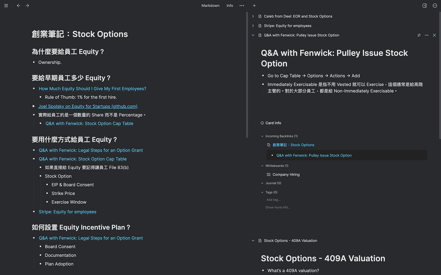
In February, we upgraded our tab feature to support a right-sidebar for users to put reference cards during writing.
March: Whiteboard Upgrade
In March, we shipped advanced whiteboard features such as fit to content, alt drag duplicate, undo-redo, tidy up, dragging blocks to create new cards, custom arrow directions, and more. We also significantly improved our whiteboard performance. All this effort aims at a single purpose to make our whiteboard as intuitive as possible and help you think better than any other tool.

April: Command Palette
When you have a great thinking tool, notes pile up quickly, and when you have thousands of notes, it’s not enough to rely purely on visual memory.
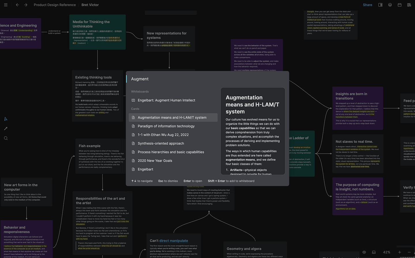
In April, we redesigned our command palette to support global search, whiteboard search, search preview, and core action shortcuts. Finding notes (Cmd/Ctrl + O) and navigating the app (Cmd/Ctrl + K) has been easier than ever.
May: Nested & Linked Whiteboard
With more notes you need more whiteboards to organize these notes. When users have many whiteboards, they seek a better organization for these whiteboards instead of just putting all of them on one map.
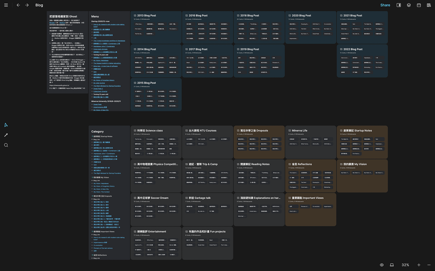
In May, we launched the nested & linked whiteboard feature that allows creating whiteboards inside whiteboards and linking from one whiteboard to others. The combination of whiteboard hierarchy and the card graph has been perfect for heavy knowledge work.
June: Journal
After tackling problems of better thinking and creating, we want to improve the experience of collecting fleeting ideas. We noticed that users don’t want to create cards for fleeting ideas. They want a place to dump their thoughts without polluting the Card Library.
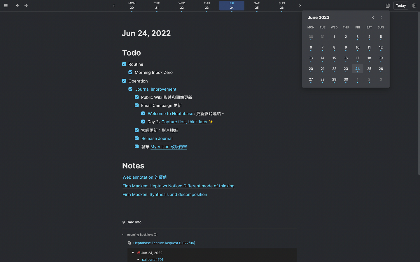
In June, we introduced Journal, a place for you to dump ideas every day and convert these ideas into cards later. The bi-directional reference between Journals and Cards removes the friction of capturing ideas and adds the time dimension to our knowledge base.
July: Editor Upgrade v1
Better creating is not just about cross-referencing notes but also about whether you have a good writing experience. Our card editor was simple, and we wanted to make it more powerful.
In July, we spent a lot of time upgrading our card editor and introducing new features such as tables, toggle lists, better drag & drop, mention date, mention whiteboard, embed videos, LaTeX improvement, block menu, and more.
August: Breadcrumb Navigation
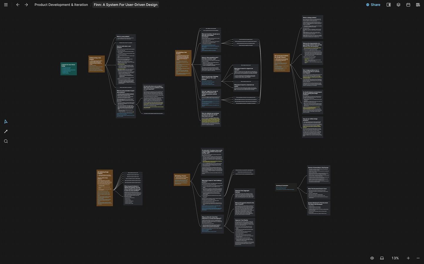
After launching nested whiteboards in May, we noticed that it’s easy to lose orientation when you have more than three layers of whiteboards. In August, we introduced breadcrumbs to remind users of their location in the whiteboard hierarchy.
September: Sections & Text Elements
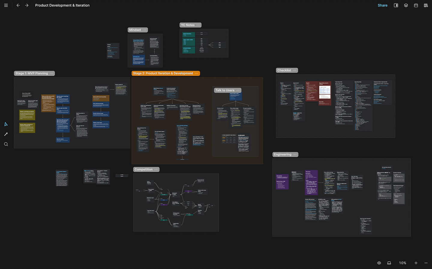
When users have hundreds of cards on a whiteboard, it’s hard to see the big picture. In September, we introduced sections to let users group their cards into different areas so that they can have a better sense of the big picture. We also introduced text elements that allow users to annotate their whiteboard without adding cards with only a few words.
October: Real-time Sync
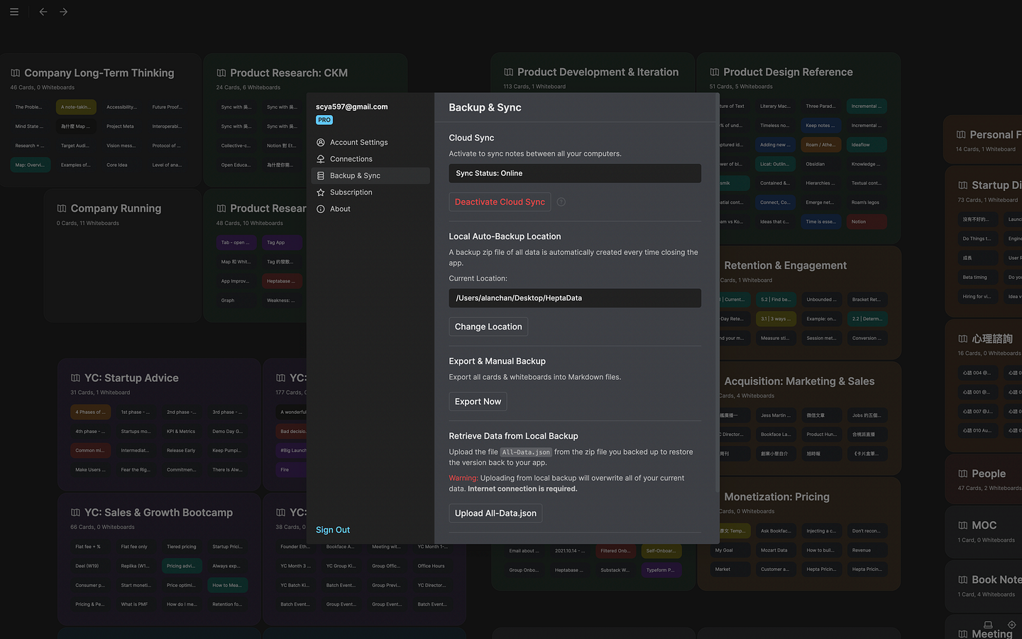
Our cloud sync was not perfect. Syncing could have conflict. We noticed this problem early on and decided to start tackling it in August. After three months of rebuilding our backend, we’ve finally come to upgrade the sync feature in October. All your notes will be synced in real-time on a much granular level while retaining full offline support.
November: Journal Objects
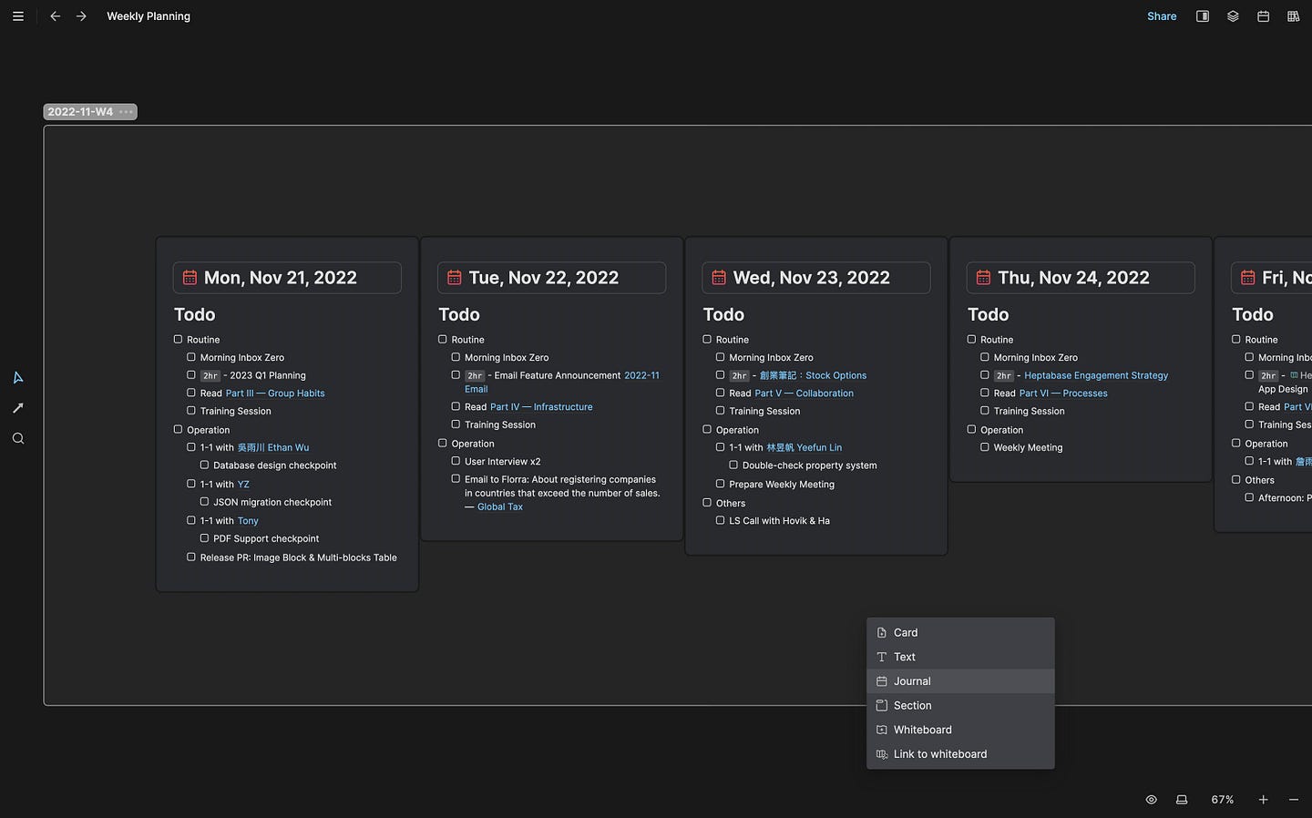
After launching Journal in June, we noticed Journal is more than just a tool for capturing fleeting ideas. Instead, many users used it to plan their days and weeks.
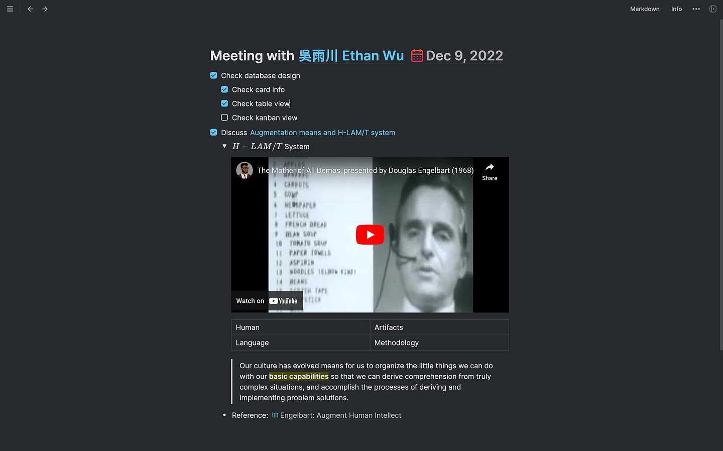
In November, we introduced putting Journals on whiteboards, such that users can leverage the power of visual thinking to achieve better planning.
December: PDF Support & Editor Upgrade v2
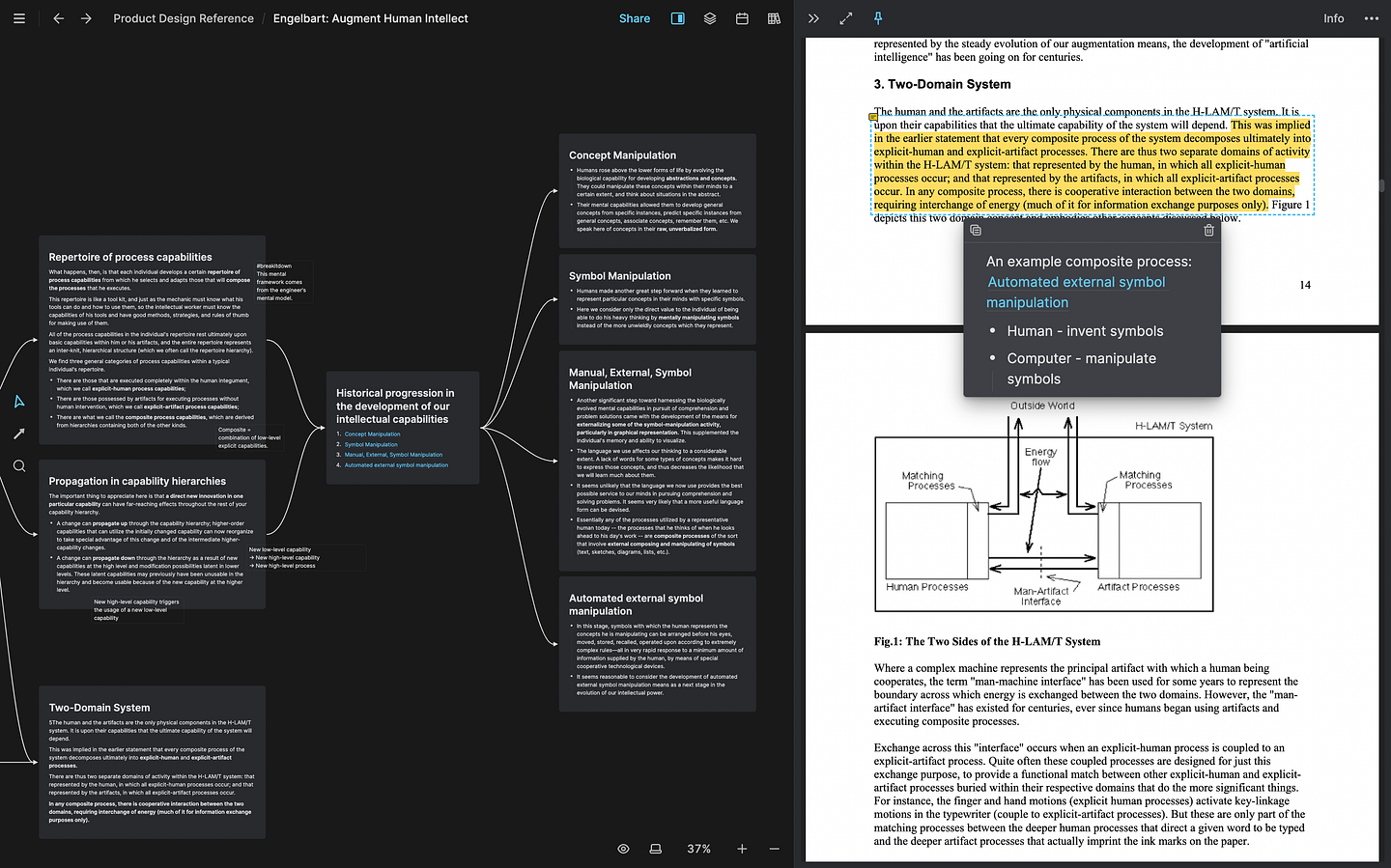
Many users are researchers who spend tons of time working with PDF files. After launching real-time sync in October, we’re in a great position to add more integrations with different file types that support offline mode and real-time sync.
In December, we introduced PDF cards. Users can add PDF files to the Card Library and use them in all places. We also support a powerful annotation tool for these PDF cards.
Aside from PDF support, we’ve also upgraded our editor to improve performance and support advanced features, including links to blocks, changing table width, multi-blocks in table cells, colored text, and more.
What’s next
As I said in the beginning, in 2022, we focused entirely on building tools for collecting, thinking, and creating. In 2023, we will use the foundation we built last year to take Hepta closer to our vision. Here’s a sneak peek of what’s coming:
Collecting
- Web App: To help you access your notes when using computers at work, we will launch the first version of web app tomorrow! The initial loading time could be a bit long because it loads all your notes into the browser at once. We’ll continuously improve this part with upcoming iterations.
- Mobile App: To help you collect ideas wherever you are, the first version of the mobile app will come in Q1.
- Web Annotation: To help you bridge the gap between web reading and note-taking, aside from Readwise integration and PDF annotation, we’ll support annotating web pages and a place to manage all your highlights & annotations. You should be able to search highlights & annotations alongside your cards and convert them into cards easily.
Thinking
- Tag as Database: To help you better manage notes of the same type (e.g., meetings, books, tasks, etc.), a significant upgrade of the tag feature is coming in January. Each tag is equal to a database that supports multiple views. We’ll provide a global property system to conform with these tag databases.
- Highlight Objects: To help you integrate your reading experience with your thinking environment seamlessly, we’ll allow you to put all highlights and annotations on the whiteboards to make sense of what you’ve read and learned.
- Mindmapping: To reduce the time you spend creating the visual layout, we’ll support the native mindmap structure in the whiteboard to make things more automated and help you focus on thinking itself.
- Spaced Repetition: To augment your memory of important knowledge, we’ll incorporate the spaced repetition technique into your reading and thinking environment. We’re a sponsor of Andy Matuschak, a lead innovator in the field, and we have been following his research closely to help us design this part of the product.
Creating
- Editor Upgrade: To help you write and express your thought more easily, we’ll support advanced editor features such as templates, block embedding, nested blocks, column layouts, toggle headings, and more.
Sharing & Exploring
- Hepta Platforms: To help you explore and share ideas with others using the existing card system, we’ll enable individuals, teams, and communities to explore, share, communicate, and reuse ideas without disturbing each other’s independent thinking process. We’ve rebuilt our entire backend infra in Q4 in preparation for this. There’s no estimated launch date yet, but if you and your team & group need early access, please schedule a user interview with me first, and we’ll gradually roll out invites to the private beta.
Last words
Above is what we’ve done in 2022 and our initial plan for 2023. Thank you for your support and feedback in the past year. We’ll continue to put all our effort into designing and developing the best product and help you integrate the knowledge lifecycle of “exploring → collecting → thinking → creating → sharing.”
If you have any feedback or suggestions for Heptabase, always feel free to talk to us in our Discord Community (which has almost 7k members now!) or schedule a 1–1 video call with us. We can’t wait to take Heptabase to the next level with you this year!

Heptabase 的用戶你好,
我是 Alan,Heptabase 的共同創辦人兼 CEO。距離我們發布 Heptabase 的公開 Beta 版已經快一年了。今天是 2023 年的第一天,我想藉這個機會做一次年度回顧,簡述一下我們在 2022 年完成了哪些事,並分享我們對 2023 年的規劃。
願景回顧
我們成立 Heptabase 的願景是打造出一個脈絡化的知識網路,以及圍繞在這個知識網路周圍的工具生態,進而幫助全世界的知識工作者打通「探索 → 收集 → 思考 → 創作 → 分享」的知識生命週期。
Heptabase 的願景包含了兩大部分:
- 一個專門幫助你串連收集、思考和創作流程的工具鏈。
- 一個專門幫助你分享和探索知識的的脈絡化知識網路。
在 2022 年,我們將全部的精力放在第一部分:打造一個專門幫助你串連收集、思考和創作流程的工具鏈。以下是我們這一年來針對這部分所做的事情。
一月:雲端同步
Heptabase 的第一版是一個完全基於本地的工具,而我們有非常多用戶希望可以在多台裝置使用 Heptabase。
在一月,我們發布了第一版的跨裝置同步功能與圖片上傳功能。如果你開啟了同步,所有資料都會在傳輸和存儲的過程中受到加密保護。
二月:右側欄
在創作知識的過程中,我們常常會需要交叉比對之前做過的筆記。雖然 Heptabase 的白板可以讓用戶更清楚地看到筆記之間的關聯性,但是光靠白板要將這些關聯性轉換成最終的知識產出還是有一定的阻力。
在二月,我們升級了 Tab 系統,讓用戶在寫作時可以將需要參考的筆記和文獻開在 Tab 的右側欄做交叉比對。

三月:白板升級
在三月,我們發布了許多進階的白板功能,例如卡片高度的自適應、Alt Drag 複製卡片、Undo/Redo、卡片快速排版、拖曳多個區塊到白板上創建新卡片、自定義的箭頭方向等等。我們同時也大幅提升了白板的操作性能。這些努力都是為了同一個目的:讓我們的白板變得更加直覺、讓你的思緒更加清晰無阻。

四月:命令面板
隨著 Heptabase 輔助思考的能力變強,用戶在上面記的筆記也變得愈來愈多。當你有數千張筆記時,光靠視覺記憶找筆記也會變得更加困難。
在四月,我們重新設計了命令面板,支援全局搜尋、白板搜尋、搜尋預覽、核心功能的快捷鍵,讓找尋筆記(Cmd/Ctrl + O)和在 App 裡頭的快速導航(Cmd/Ctrl + K)變得更加輕鬆。

五月:層狀白板與白板鏈接
當筆記變多時,我們會需要更多白板來管理這些筆記。而當白板變多時,我們則會需要用更好的方式來組織這些白板,而不只是單純把所有白板放在同一個地圖上。
在五月,我們推出了層狀白板與白板鏈接的功能,讓用戶可以在白板中創建新的子白板或連結其他白板。我們發現階層式的白板架構搭配網狀式的卡片架構讓知識的管理變得更加容易、靈活但又不會失去方向。

六月:Journal
在解決了許多涉及思考和創作環節的問題後,我們接著希望強化用戶收集快閃想法的體驗。我們注意到許多用戶並不希望用卡片來存儲快閃的想法,而是希望可以有一個地方可以隨意地紀錄思緒而不會污染到既有的卡片庫。
在六月,我們推出了 Journal,一個可以讓你每天隨意紀錄想法的地方,這些想法未來如果有需要都可以再輕易地被轉換成卡片。Journal 和卡片之間的雙向鏈結不只消除了紀錄想法的阻力,更為你的知識庫提供了一層時間的維度。

七月:編輯器升級 v1
除了筆記的交叉比對以外,好的文字編輯體驗也對創作的效率至關重要。我們早期的卡片編輯器比較簡單,而我們希望它變得更強大。
在七月,我們花了很多時間在打造新的編輯器功能,包含表格、Toggle lists、更好的拖曳體驗、提及日期和白板、嵌入影片、LaTeX 數學式編輯體驗、區塊的轉換等等。

八月:麵包屑導航
在我們於五月推出層狀白板的功能後,我們發現用戶很容易會忘記自己現在在哪一層白板裡頭。因此在八月,我們推出了左上角的麵包屑功能,幫助用戶更清楚知道自己所在的位置,也更容易在白板地階層之間切換。

九月:Sections、Text Elements
當用戶的白板上有數百張卡片時,就會比較難看清楚白板的全局結構。在九月,我們推出了 Section,讓用戶可以將卡片分群在不同的區域裡頭,獲得更清楚的全局視角。除此之外,我們注意到有些用戶會希望在白板上添加一些只有幾行的文字註解,因此推出了 Text Element 的功能。

十月:即時同步
我們原本的同步機制並不完美,不同裝置的資料在同步時可能會發生衝突。從八月起,我們就開始投入大量時間在研究如何打造更好的資料同步機制。在花了三個月的時間將後端砍掉重練後,我們總算在十月推出了即時同步功能。你的所有筆記都可以在保持離線存儲的前提下,用顆粒度最小、最即時的速度在不同裝置之間同步。

十一月:Journal 物件
在六月推出 Journal 以後,我們發現 Journal 對用戶來說不只是一個捕捉想法的工具,同時也是一個做日程規劃的工具。
在十一月,我們推出了讓用戶將 Journal 放到白板的功能,進而藉由白板的視覺化能力來更好的規劃每一週、每一個月的事項安排。

十二月:PDF 整合、編輯器升級 v2
我們有許多用戶是研究員,花非常多時間在讀 PDF 的文獻。自從十月推出即時同步後,我們的後端有了非常好的基礎,可以逐步地添加不同的檔案類型,並同持支持離線存儲和即時同步。
在十二月,我們首先推出了 PDF 卡片的功能。用戶可以將 PDF 檔加入自己的卡片庫,並將這些 PDF 卡片使用在所有地方。我們同時也支持對 PDF 註解並和卡片關聯的功能。
除了對 PDF 的支持以外,我們也再次升級了我們的編輯器,不只大幅改善編輯的性能,更推出了許多進階功能,包含區塊鏈接、表格寬度調整、表格內支援多重區塊、文字顏色等等。

下一步的規劃
正如我在文章開頭所說,我們 2022 年將全部的精力放在打造一套專門幫助你串連收集、思考和創作流程的工具鏈。在 2023 年,我們會以我們當前有的東西為基礎,繼續往我們的願景向前推進。以下是一些 2023 年我們計畫做的事情:
收集
- 瀏覽器版:為了幫助你在工作用的電腦可以不安裝桌面版就能調用你的筆記,我們計畫在明天正式推出第一版的瀏覽器版本!目前載入時間會有一點長(因為我們會一次將所有筆記載入到瀏覽器裡頭),但我們很快就會在接下來的更新中持續針對這部分進行優化。
- 手機版:為了幫助你在任何地方都能收集想法,我們預計在 Q1 推出第一版的手機版。
- 網頁註解:為了銜接你閱讀網路資料和記筆記的體驗,除了既有的 Readwise 整合和 PDF 註解以外,我們將會讓你也可以對網頁做註解,並提供統一的地方管理你建立的所有 Highlight 和註解,讓你可以輕易地查詢並將註解內容轉換成卡片。
思考
- Tag 的資料庫視圖:為了幫助你更好地管理同質性較高的筆記(會議記錄、閱讀紀錄、任務紀錄等等),我們將於一月對 Tag 的功能進行重大升級。每一個 Tag 都會等同於一個資料庫,並且會有自己的資料庫視圖。我們會提供一個通用的屬性系統,讓你可以在 Tag 的資料庫視圖中為卡片添加不同的通用屬性。
- Highlight 物件:為了幫助你整合閱讀和思考的體驗,我們將在一月推出 Highlight 物件的功能,讓你有辦法把所有的 Highlight 和註解拖到白板上思考和解析。
- 心智圖:為了降低你花在手動排版的時間,我們將在白板上提供原生的心智圖結構,讓筆記的建立更加自動化,使你可以更專注在思考本身。
- 間隔重複:為了強化你對重要知識的記憶,我們會將間隔重複記憶法的功能整合進你的閱讀和思考環境裡頭。我們是這個領域的專家 Andy Matuschak 的贊助者,已經關注他的研究許久,正在思索如何設計好這個環節的功能。
創作
- 編輯器升級:為了幫助你更好地創作和表達你的想法,我們將會繼續推出新的編輯器功能,包含模板、區塊嵌入、層狀區塊、多行排列、收合標體等等。
分享 & 探索
- Hepta Platforms:為了幫助你使用既有的卡片系統與他人探索和分享想法,我們將使個人、團隊和社群能夠探索、分享、交流和重用卡片,而不會干擾彼此的獨立思考過程。這部分目前還沒有預計的發佈日期,但如果你或你的團隊希望參與早期使用,歡迎先與我預約用戶訪談,我們未來會優先給參與訪談者內測的邀請。
結語
以上是我們在 2022 年完成的事情,以及我們對 2023 年的初步規劃。感謝你過去一年來對 Heptabase 的支持,正是因為有你的參與和反饋,Heptabase 作為一個產品才能夠持續地迭代、進步。我們會持續投入最大的努力在設計和開發最好的產品,幫助你打通「探索 → 收集 → 思考 → 創作 → 分享」的知識生命週期。
如果你對 Heptabase 有任何反饋或建議,隨時歡迎到我們將近七千人的 Discord 社群與我們討論,或是跟我們預約 1–1 視訊交流。新的一年,請多指教!